See what had happened was, I accidentally saw my Fedi profile not in dark mode (basically how all adventures begin). Now I’ll tell you about a fairly small rabbit hole, in comparison to the other Yak-shaving chronicled here.
GoToSocial allows customization through CSS at the instance and profile level. I had customized a few small aspects (borders, layout tweak) but decided to try on a new theme and got carried away with Yak-shaving. Then I was going to just throw the CSS into a gist, got carried away again and here’s a blog post.
GoToSocial has recently shipped some fun themes and they can be customized with CSS at the profile level. The Midnight Hunt theme is pretty bold but also has some interesting CSS gradients going on, I thought maybe I’ll change the highlight color and see how I like it. Well I kept tweaking for a bit. Here’s the default theme looks like:
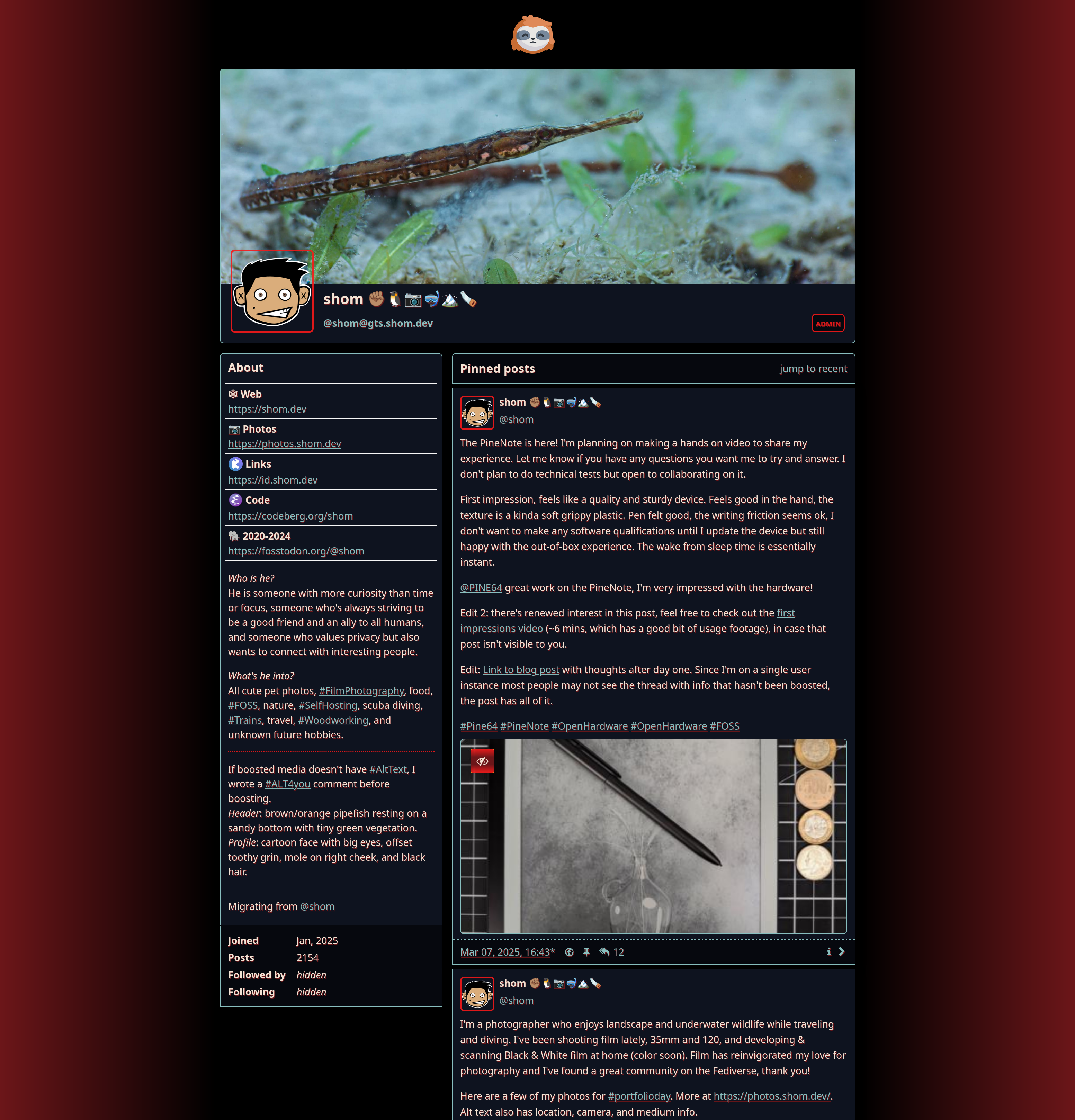
These are the instance level customizations I had previously made to my instance gts.shom.dev. I’m not a fan of borders and elements with their own background, preferring empty space for denoting boundaries. I also wanted to make the footer more responsive.
|
|
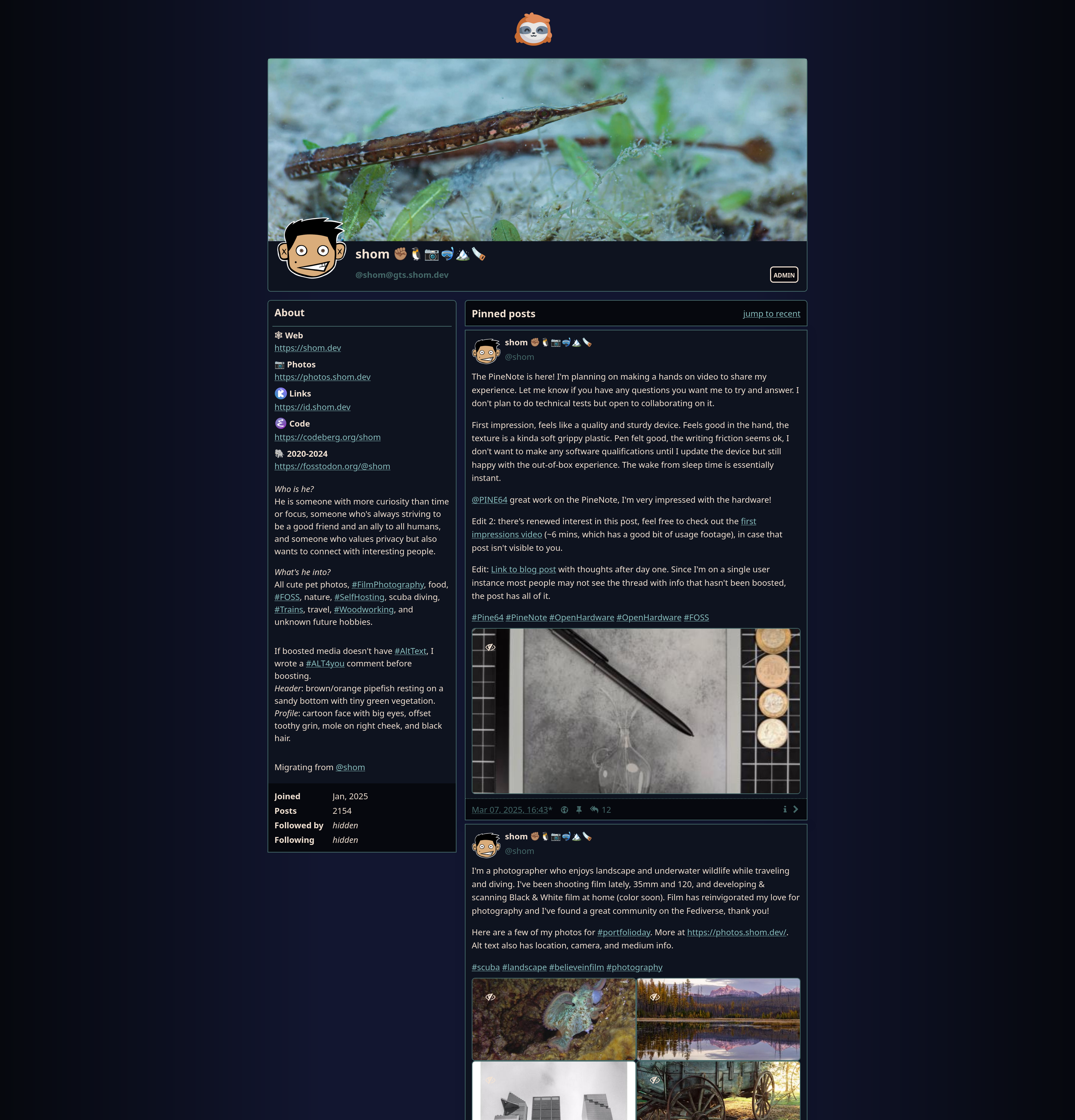
I’ve adapted it to something a little less exciting and way more drab so I guess it’s more of a New Moon Stroll now. I decided to apply all of the CSS to the instance level since I’m single user instance and I wanted the about page to match my profile page. Normally this will be applied only to the custom CSS for the profile.
Here’s the CSS snippet (the root and body are standalone and can be used in any page):
|
|
Just messing with CSS to make my profile felt like I was ‘wasting time’ but now that I have written a post about it somehow it feels like I did something useful!? It would be better to just be able to enjoy doing things because it was fun/interesting in the moment but making a blog is also kind of fun even if it did start as a ‘I should get something out of idle inquiry so I’ll write a post’.
If you want to make me feel even better about my sunk-cost, come chat about it on Fedi.
Updated 2025-07-06: updated colors to meet accessibility contrast rules.